GRAPHIC DESIGN, GAME, PACKAGING
Role-Playing Cards
Context
Fall 2020 senior graphic design academic project.
My Role
Sole designer, individual project.
Overview
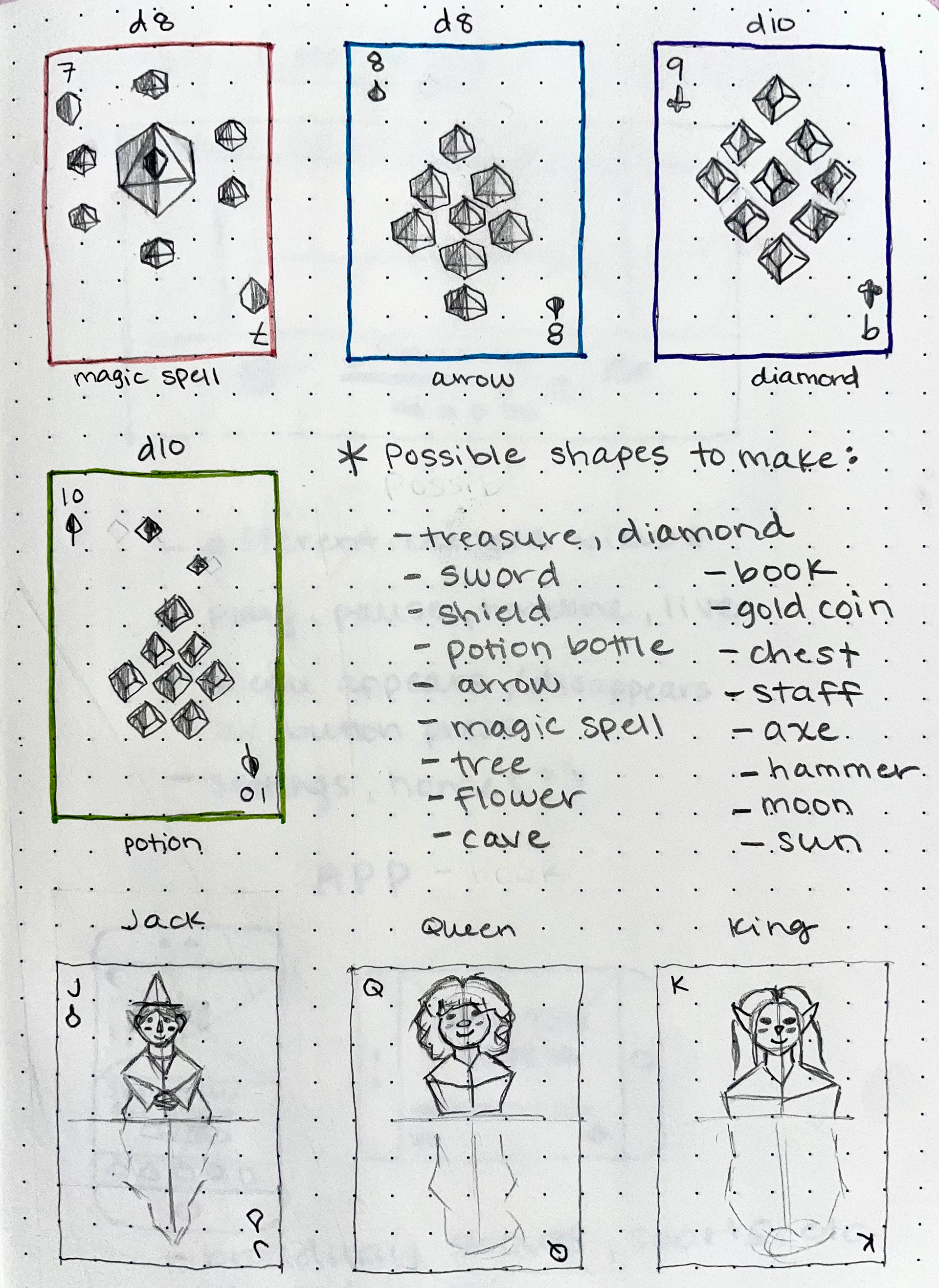
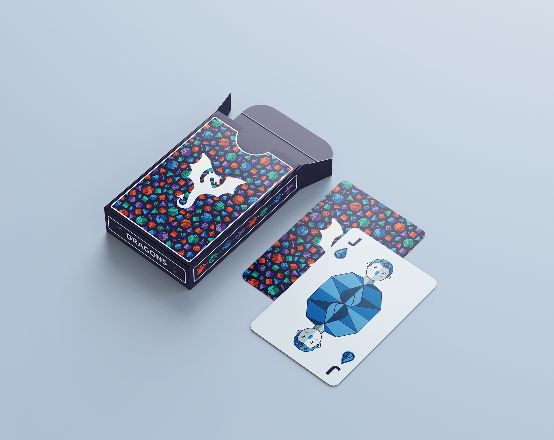
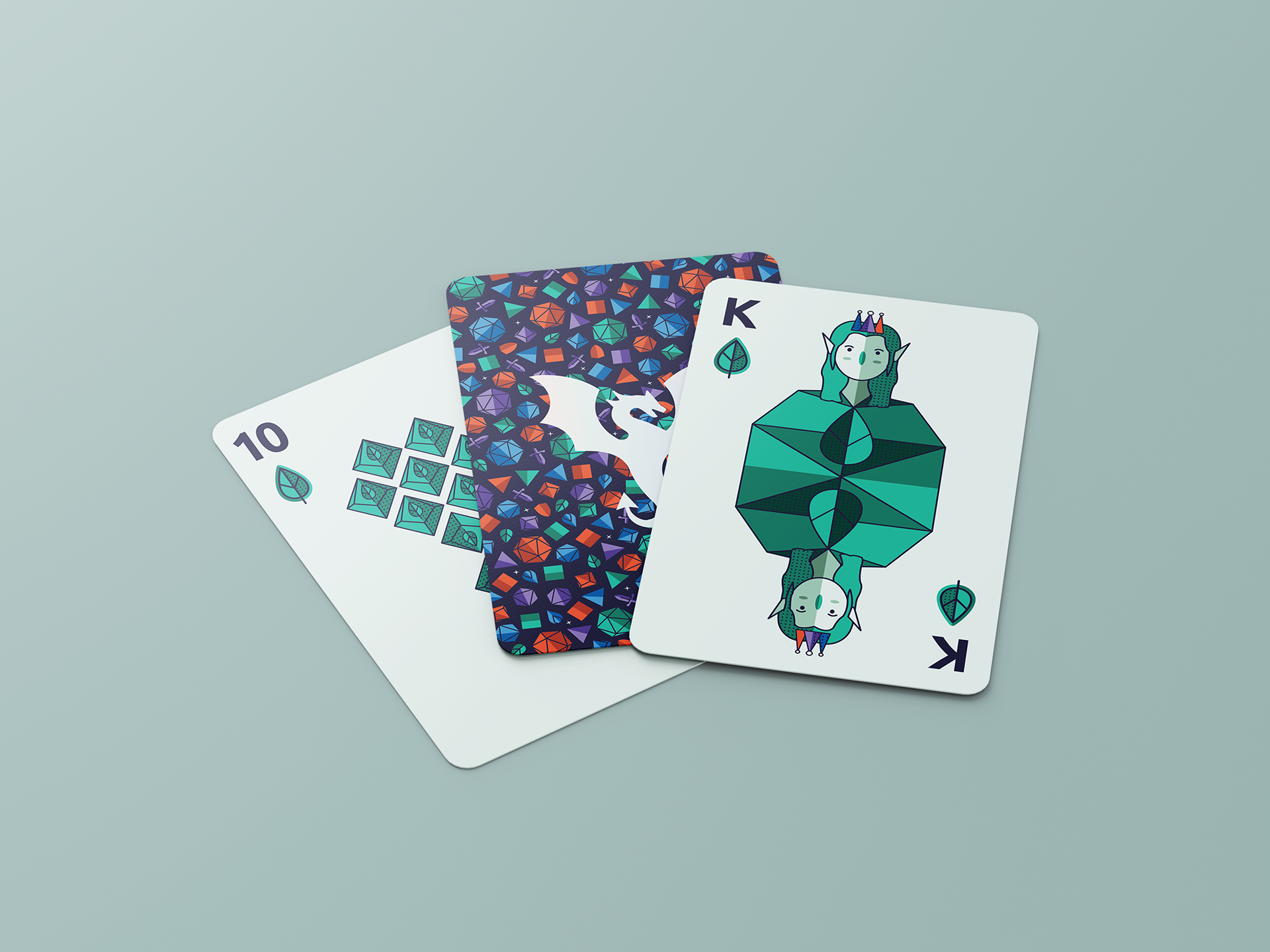
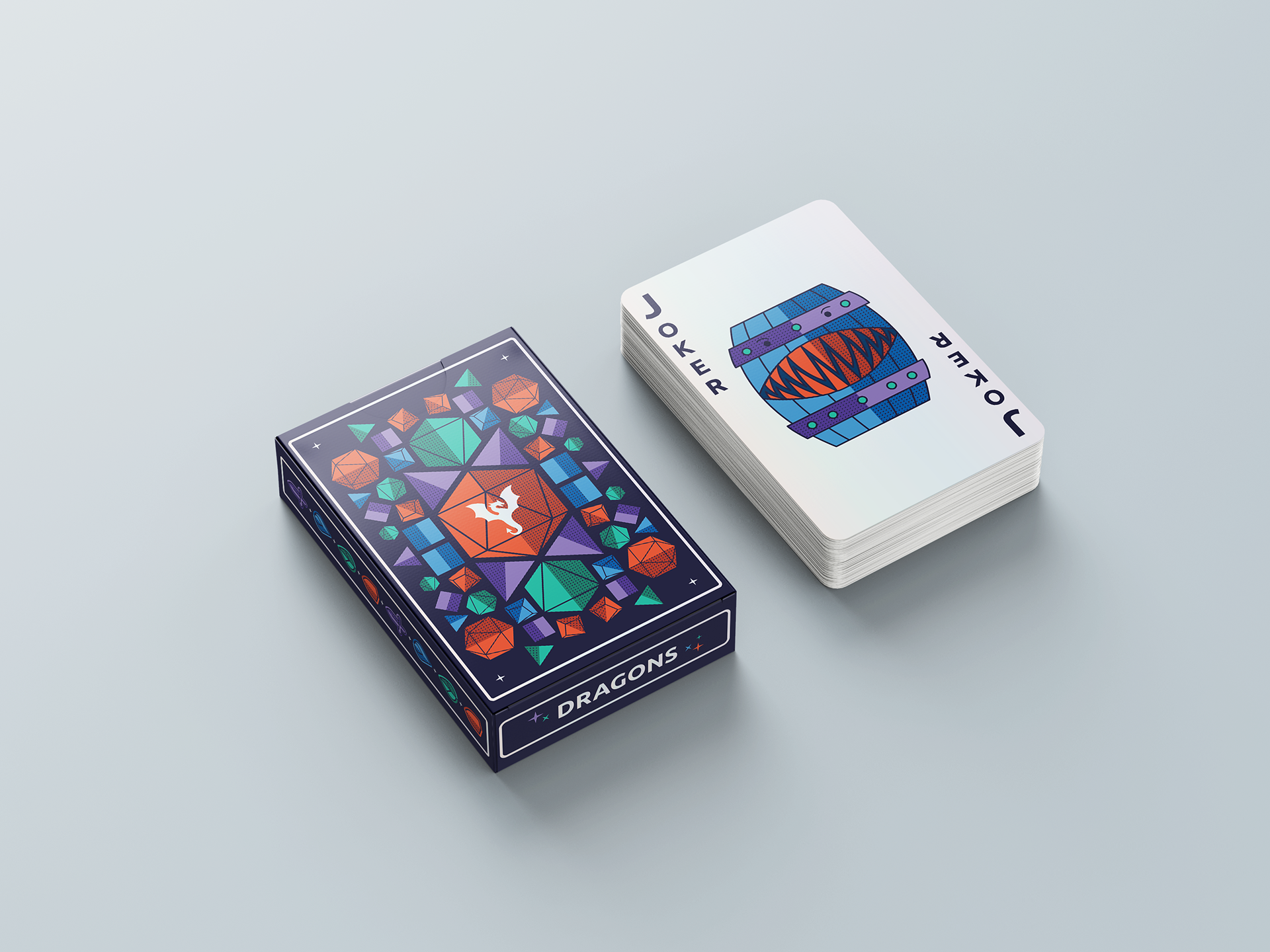
In this project, I designed a unique deck of playing cards based on the Dungeons & Dragons roleplaying game. For a good user experience, I assigned each suit I created (dagger for rogue, shield for fighter, leaf for druid, magic for wizard) its own matching color and tinted the background of the cards the corresponding color to help quickly identify the suit. The number cards are based on different sided die commonly used in Dungeons & Dragons, and had them arranged in patterns to make abstracted items from roleplaying games such as potions or swords. To create depth and texture, I shaded half of each graphic with a darker tone and dots pattern. I also designed the card box packaging using the dice shapes and suits to create a fun, balanced design.
I started with sketching my ideas, then moved to digital iterations in Illustrator, and finally final product mockups in Photoshop.
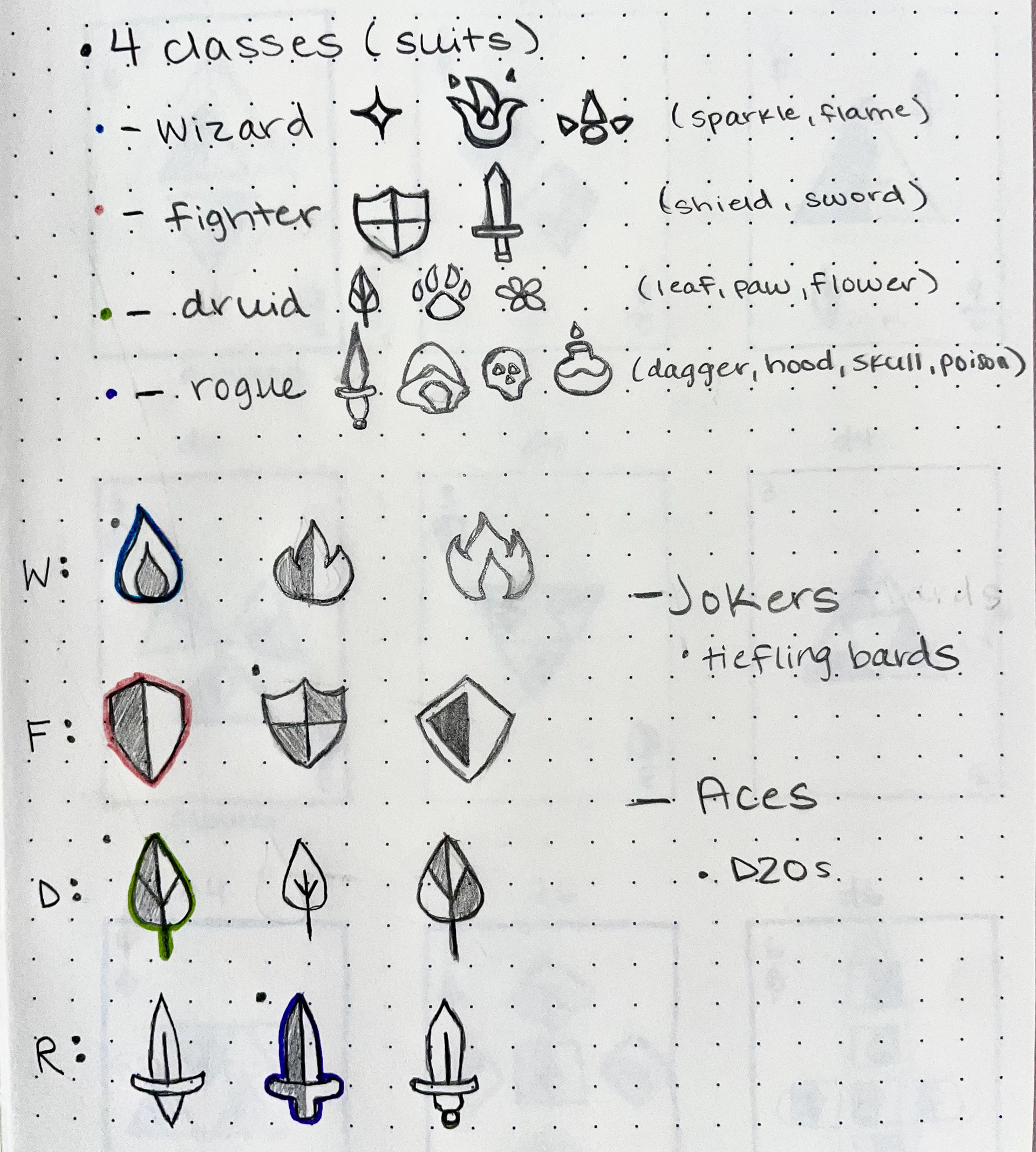
Pip Brainstorming
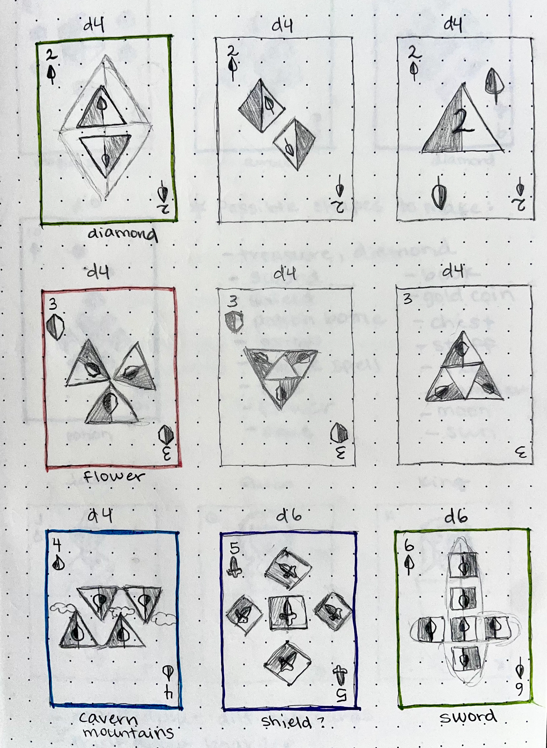
Num Card Sketches
Face Card Sketches

Card Back Sketches

UI, GRAPHIC DESIGN
Day In The Life Icons
Context
Fall 2020 senior graphic design academic project.
My Role
Sole designer, individual project.
Overview
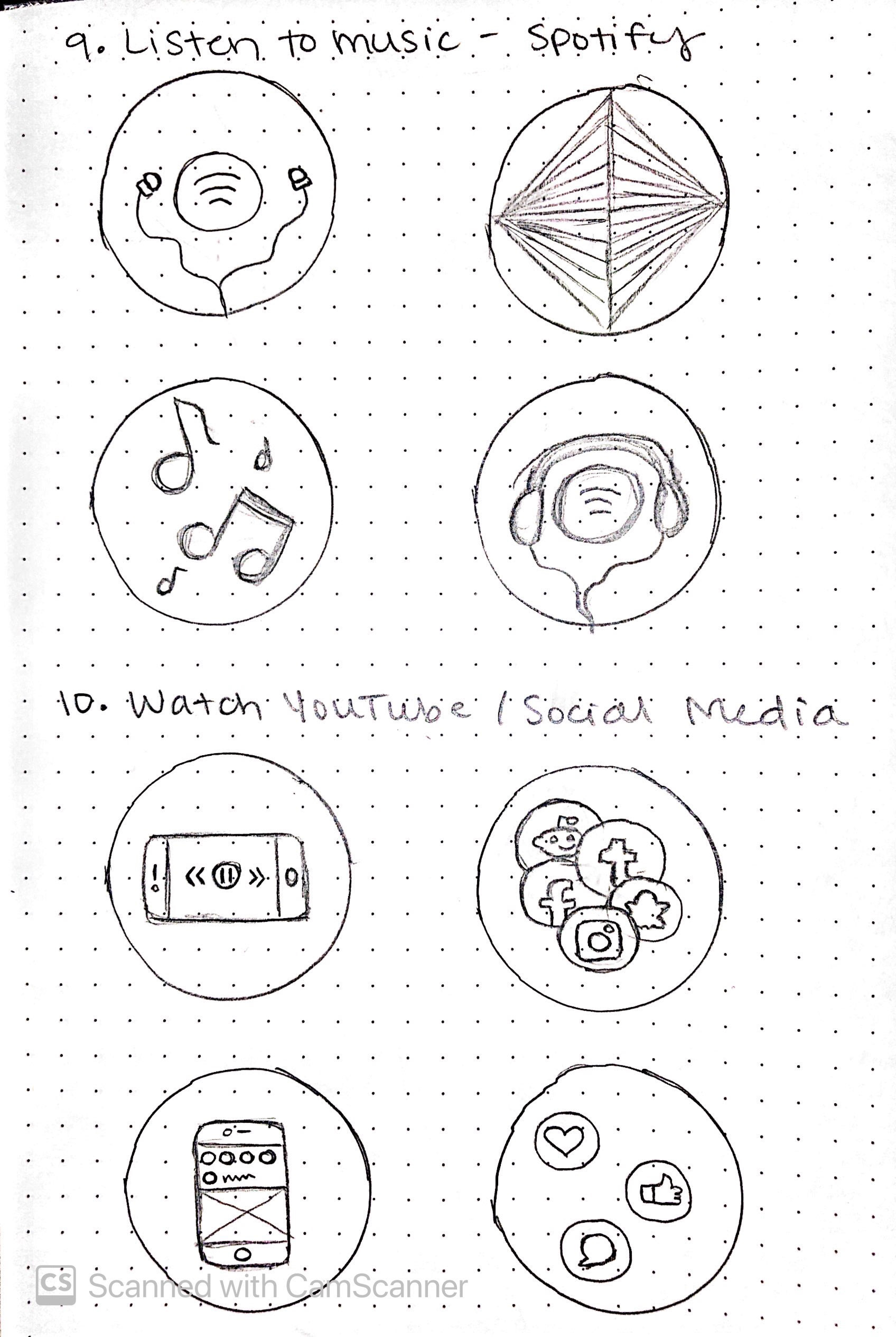
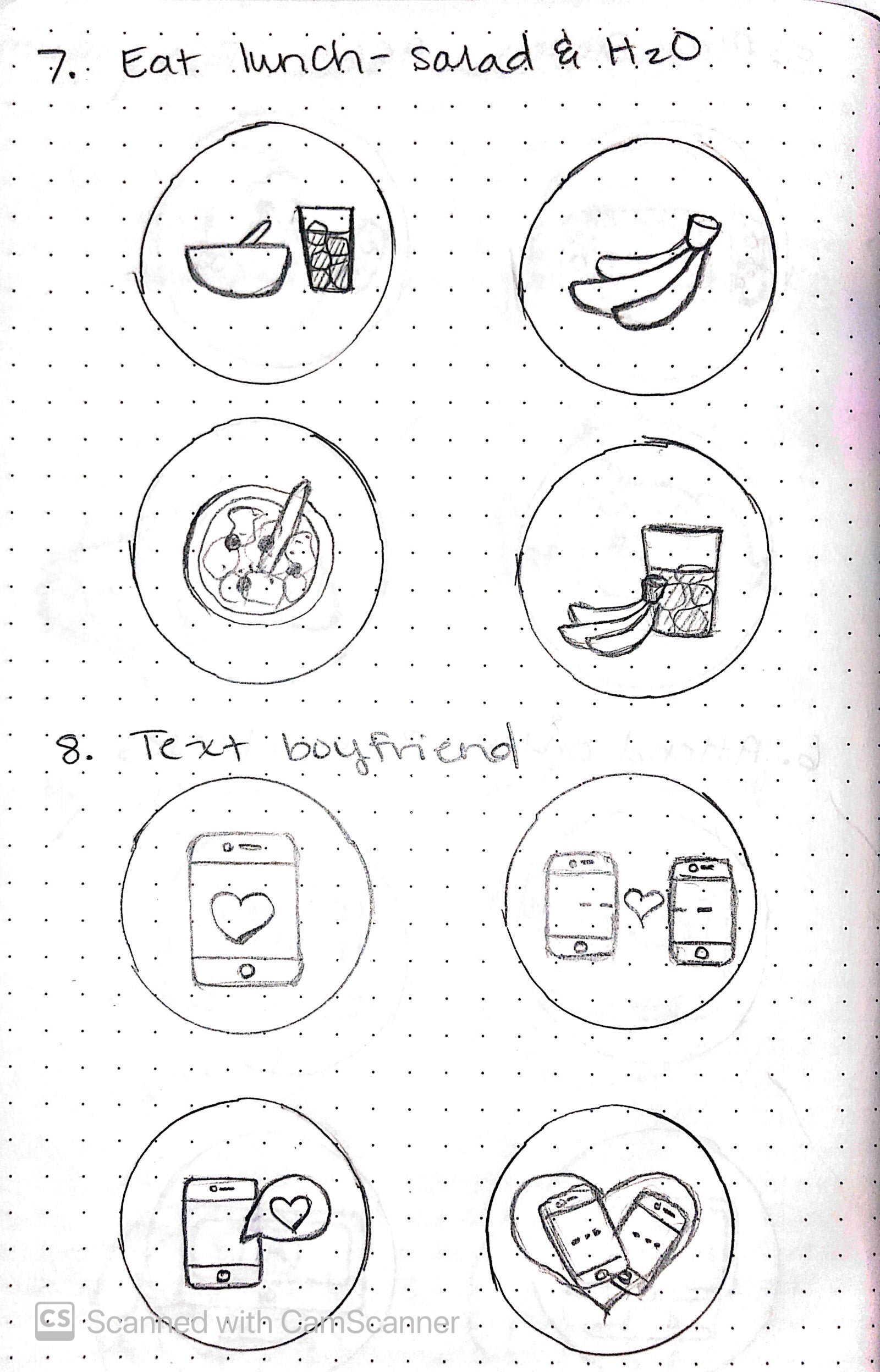
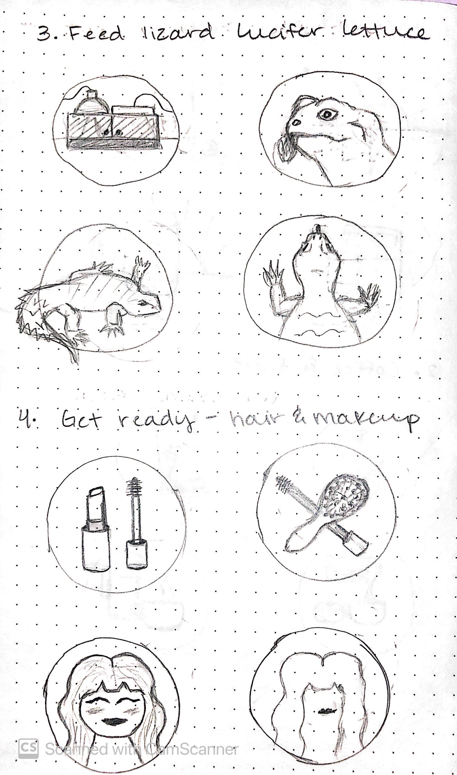
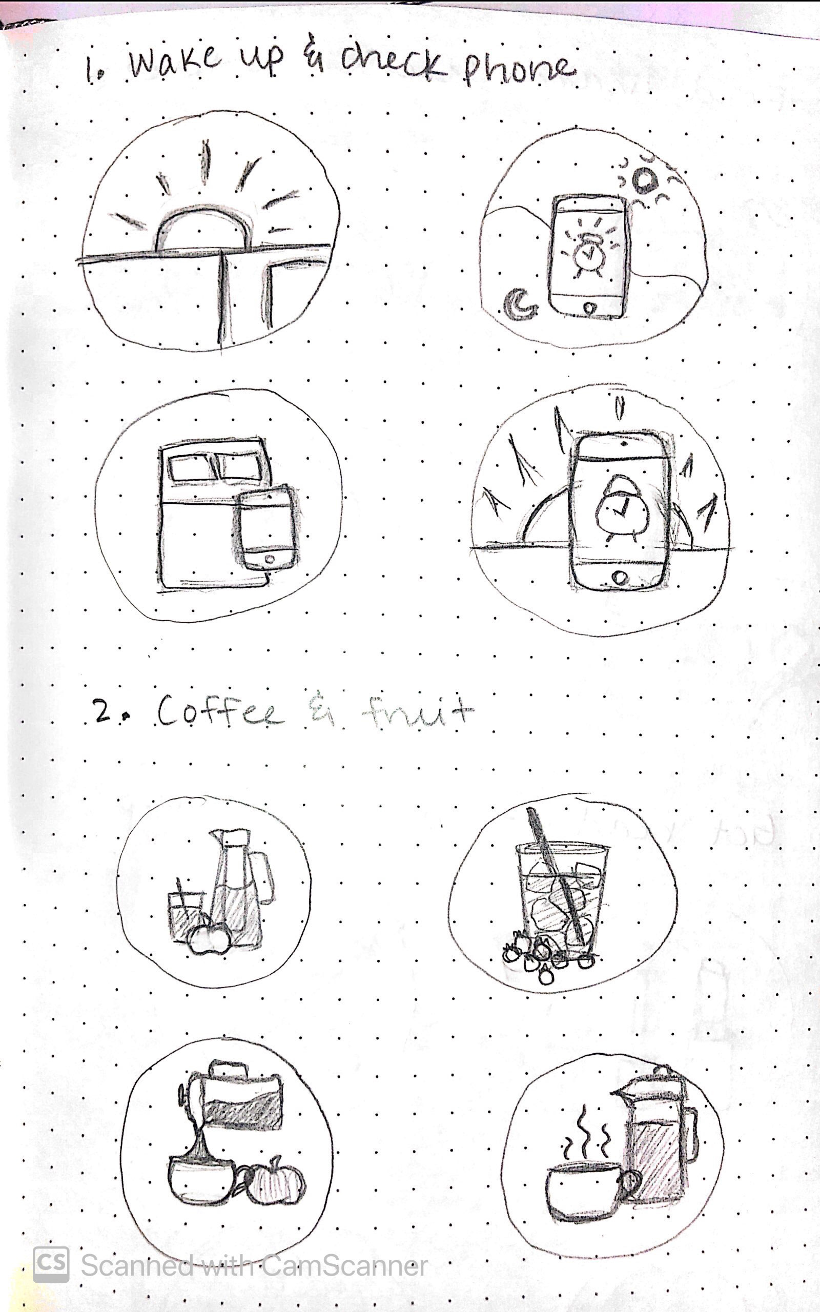
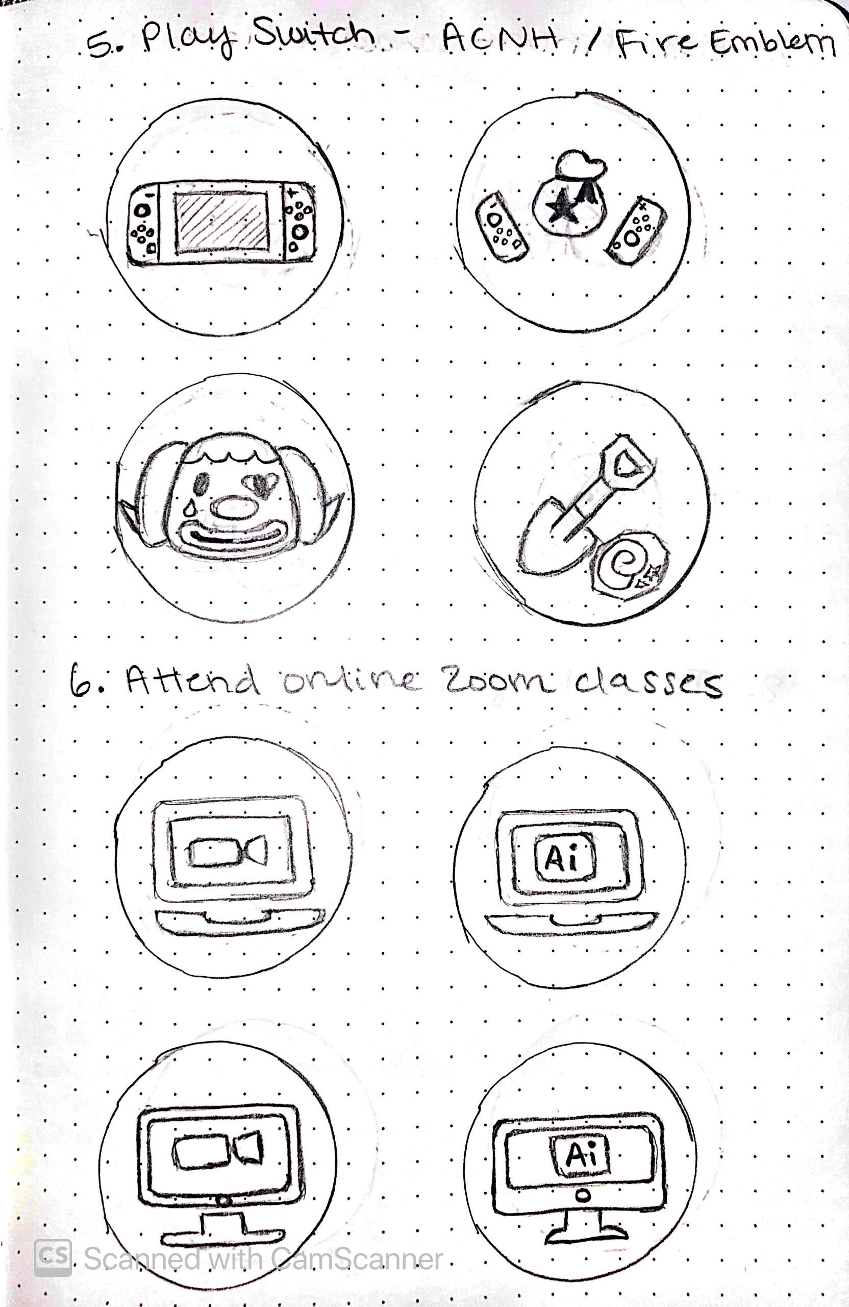
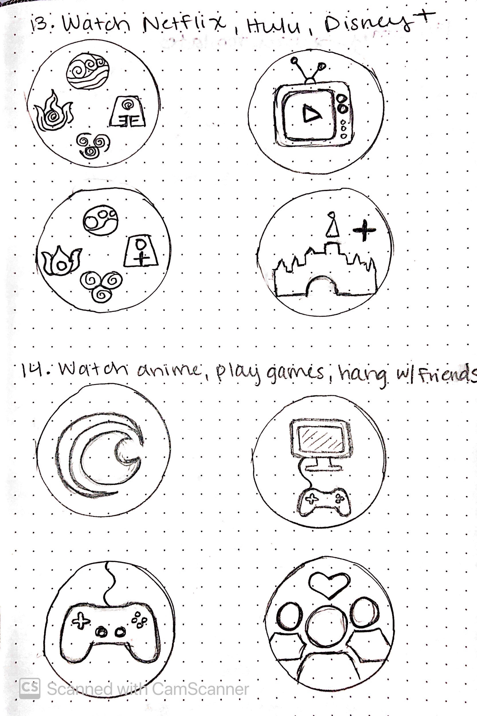
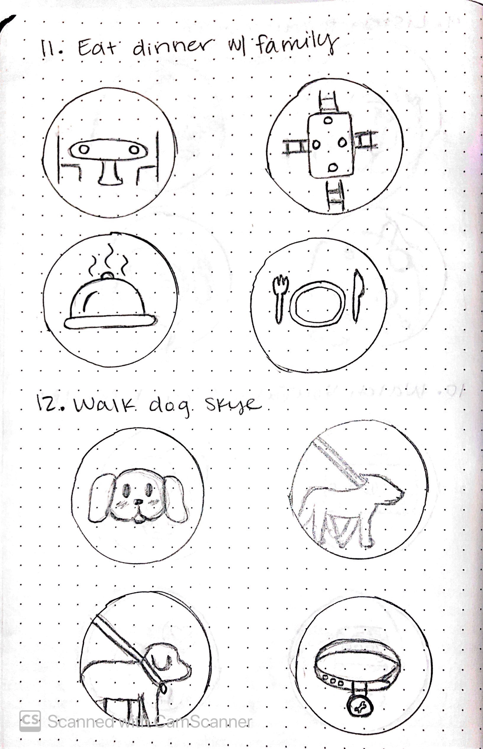
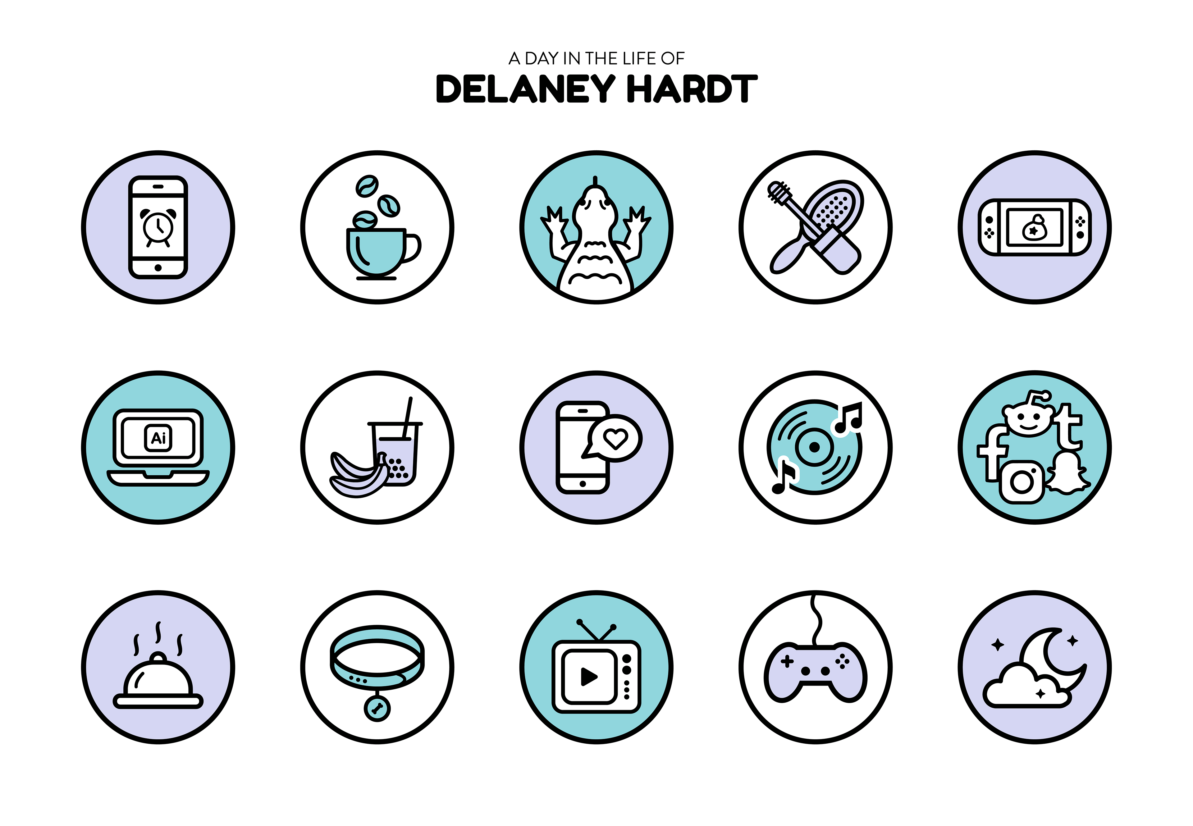
In this project, I designed a set of unique icons based on my day in the life. I brainstormed ideas of what I typically do in a day and created multiple sketch iterations for each. I created the icons in Illustrator using the same line weight and color palette for to keep them cohesive.
GRAPHIC DESIGN, TYPOGRAPHY
Austin TX Type Badges
Context
Spring 2019 junior graphic design academic project.
My Role
Sole designer, individual project.
Overview
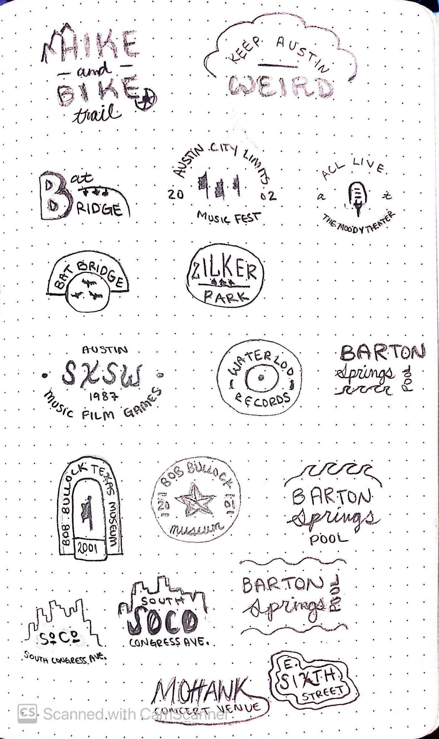
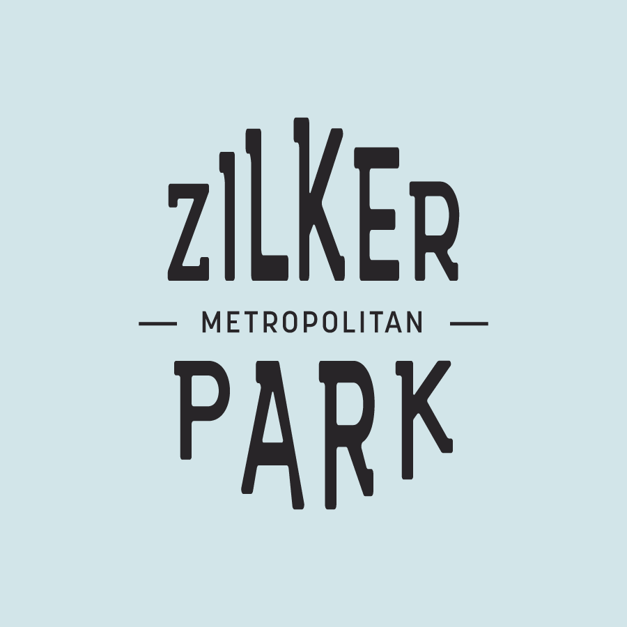
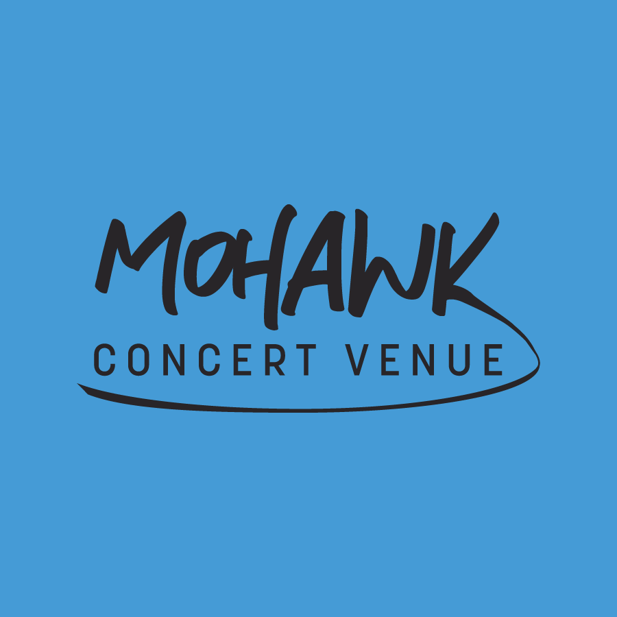
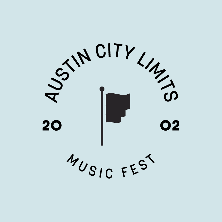
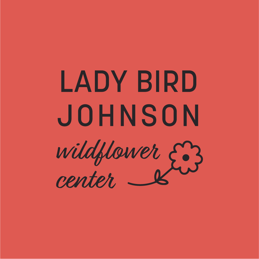
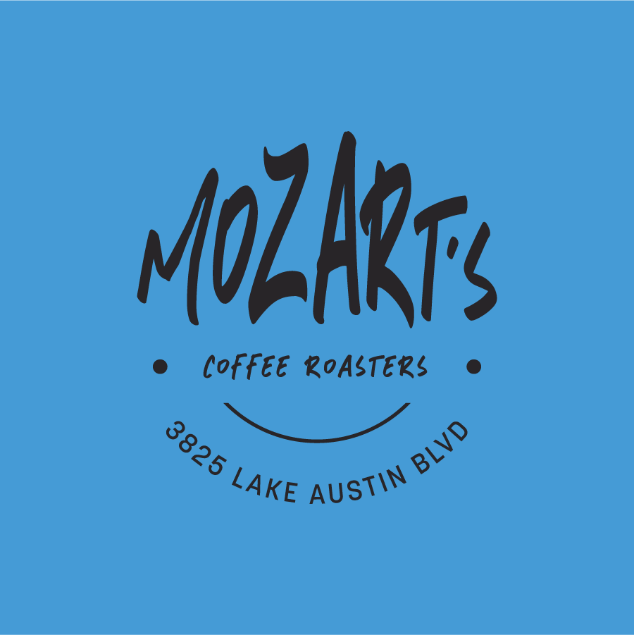
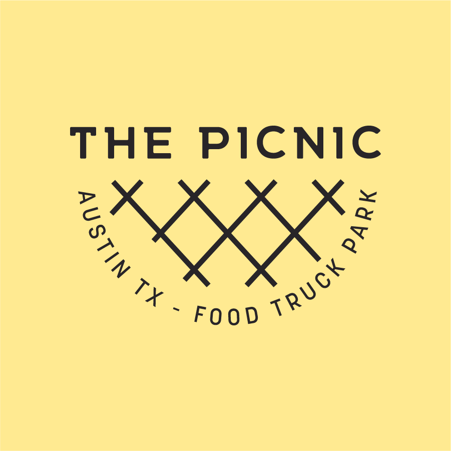
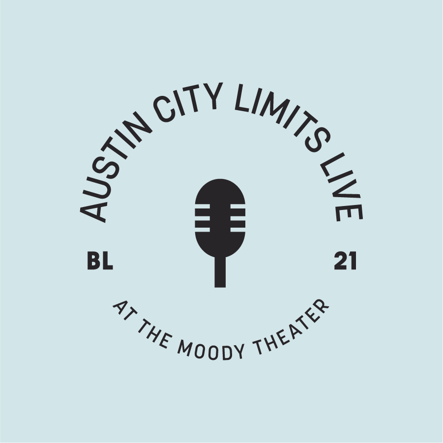
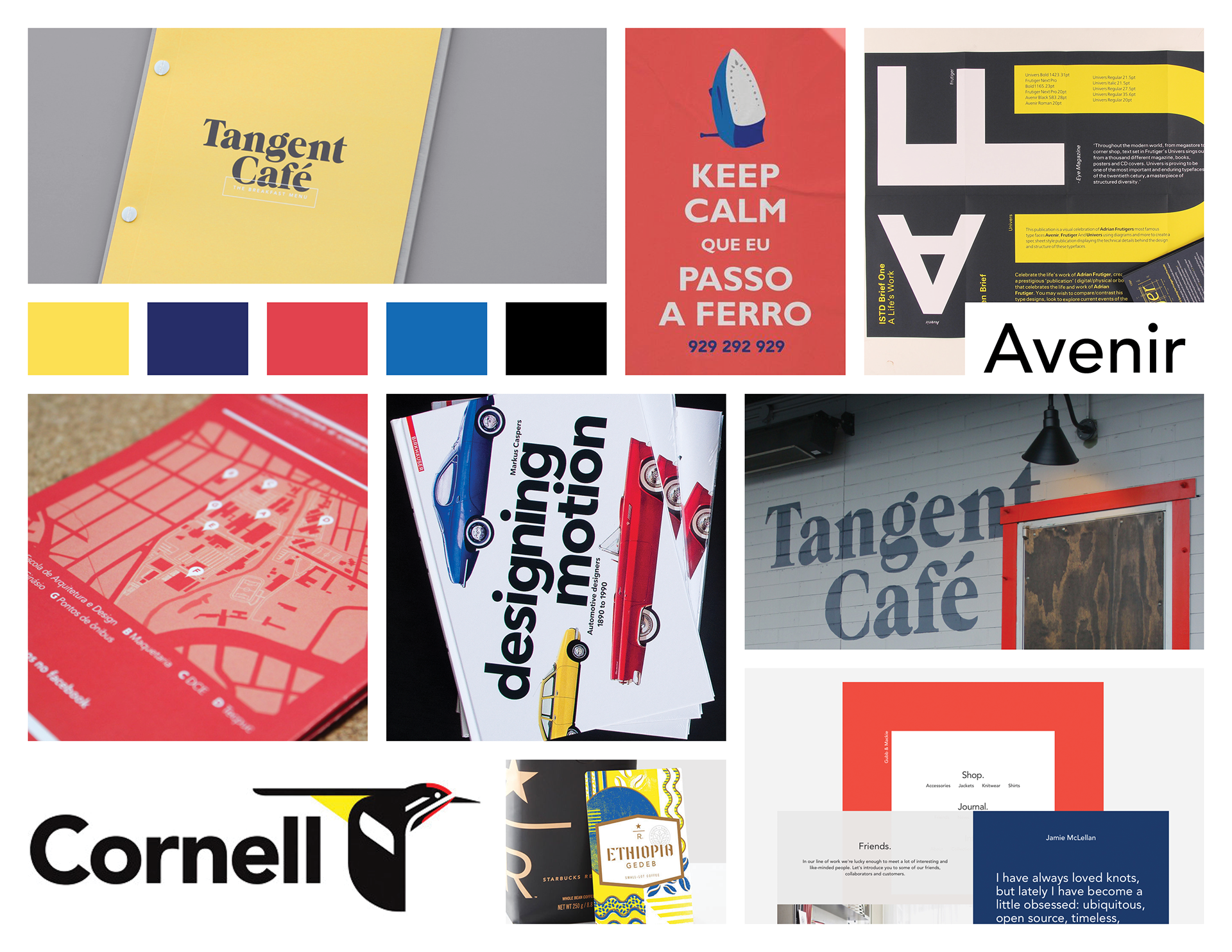
In this project, I designed a set of unique type badges based on the downtown of my home city Austin, Texas. I created a moodboard of color palette options, badges styles, and brainstormed ideas of staple Austinite things. I created multiple sketch iterations and finalized my designs in Illustrator. I limited myself to five fonts total and two fonts per badge. I kept the theme of using lines and blackwork illustrations that related to the text, creating a unique story for each personal badge.

Moodboard
Sketches










GRAPHIC DESIGN, TYPOGRAPHY
Expressive Words
Context
Spring 2019 junior graphic design academic project.
My Role
Sole designer, individual project.
Overview
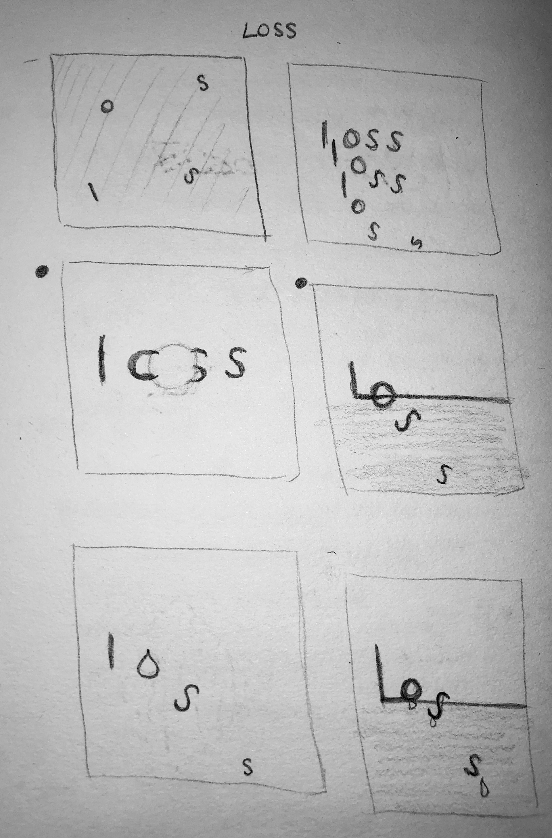
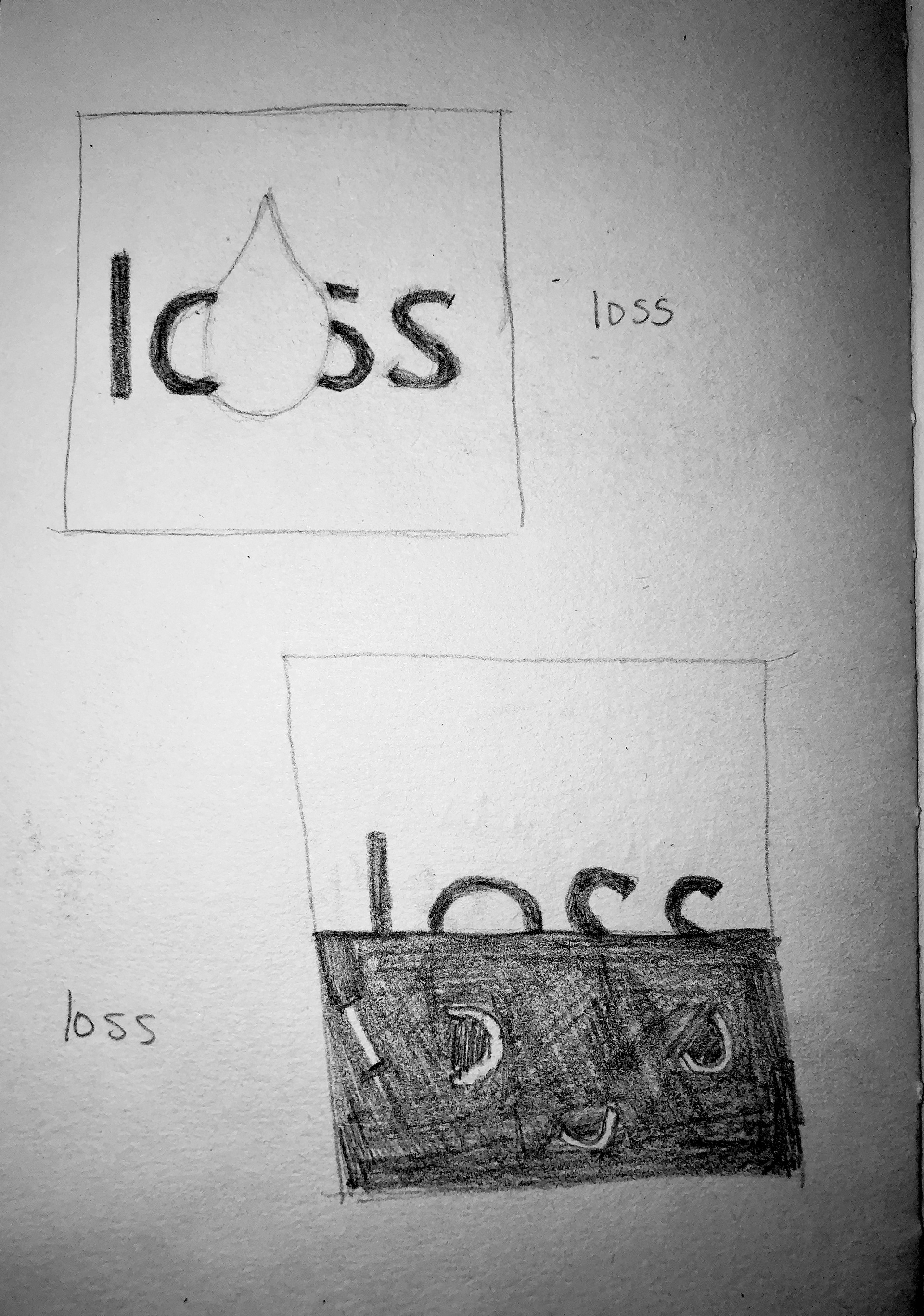
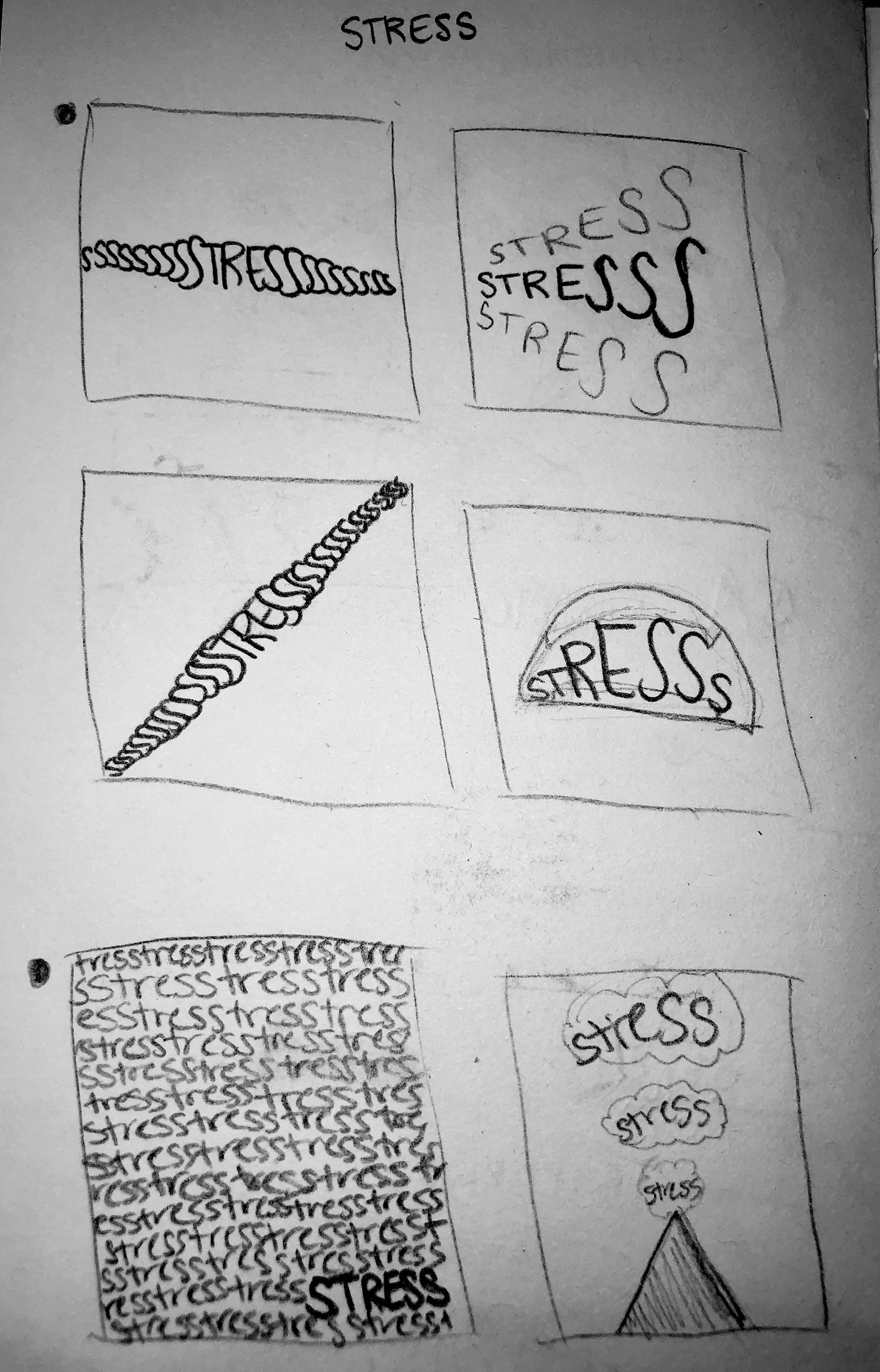
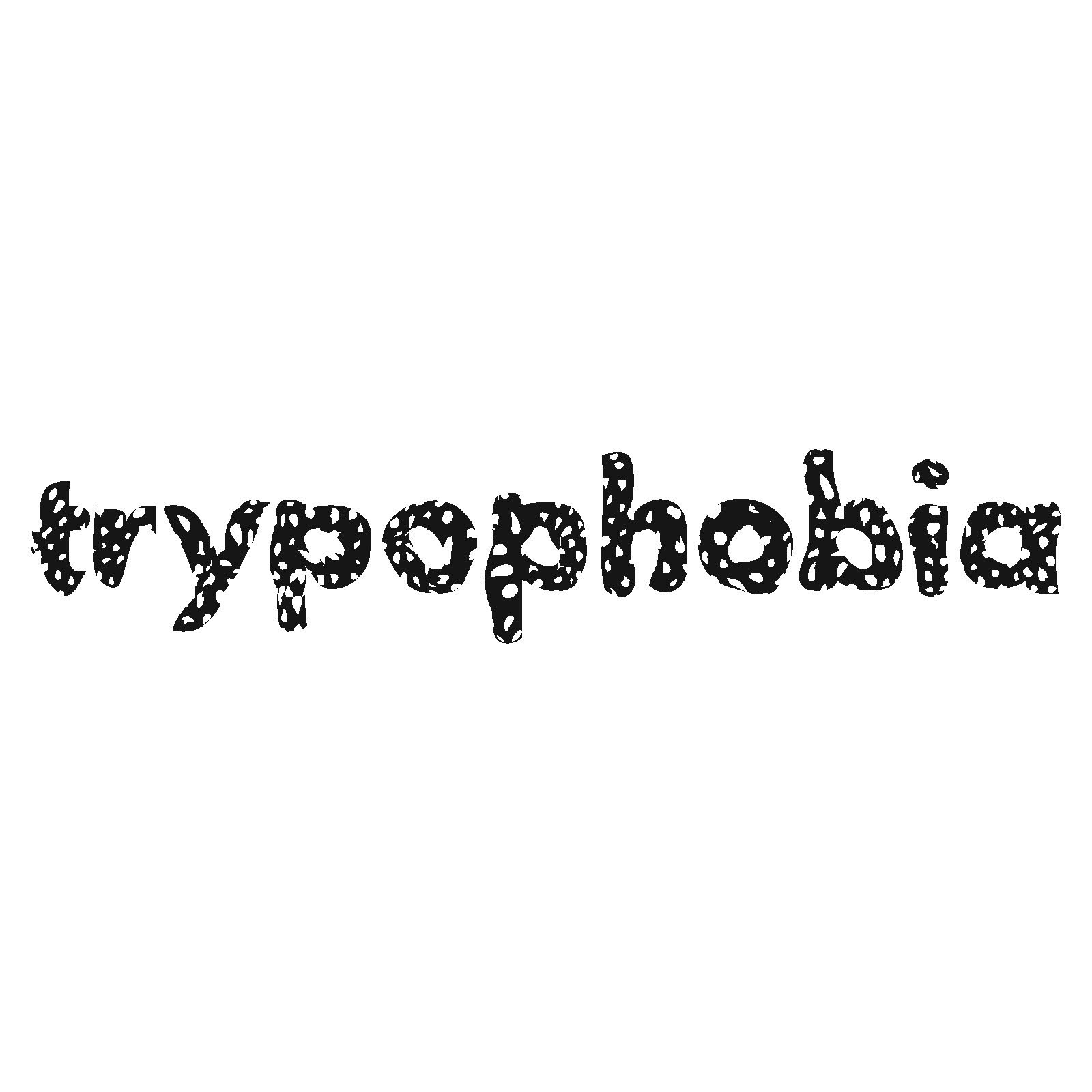
In this project, I morphed text to evoke the meaning of the words through their designs. I played around with different distortions, patterns, and negative space to express the emotion behind the word. For loss I used an empty black background to represent a void, and had the letters melting/dripping away to represent tears. For stress I repeated the word over and over slowly distorted the words more and more until the bottom is jumbled chaos, similar to how you can get fixed on a single stressful thought and spiral. For claustrophobic I wanted to encase the letters of the word in a box, making them feel cramped and trapped. For trypophobia I cut holes in each letter and made them wavy to show dizziness or nausea, which is what some people who have the phobia get from looking at holes.
Loss Sketches 1
Loss Sketches 2
Stress Sketches 1
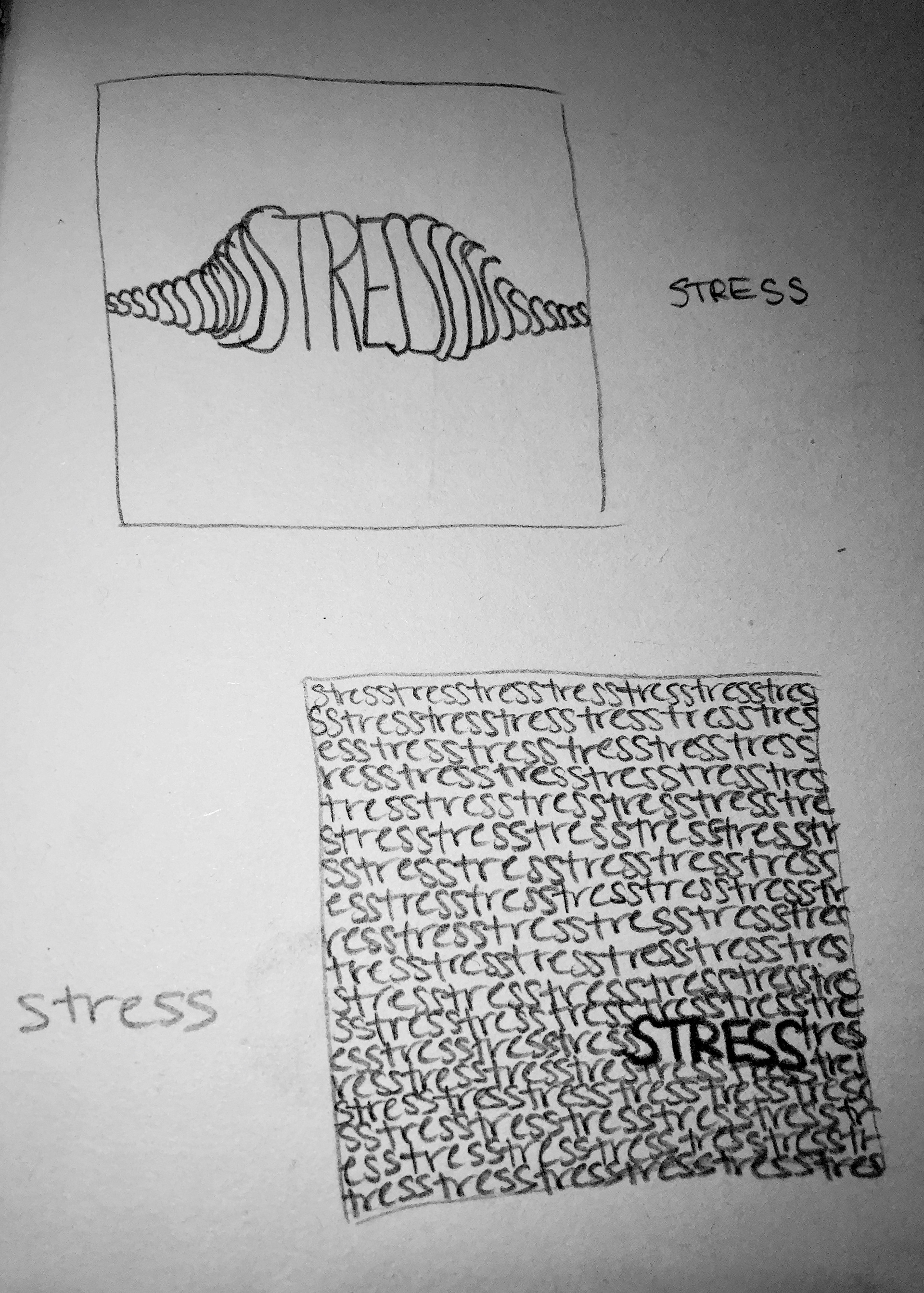
Stress Sketches 2
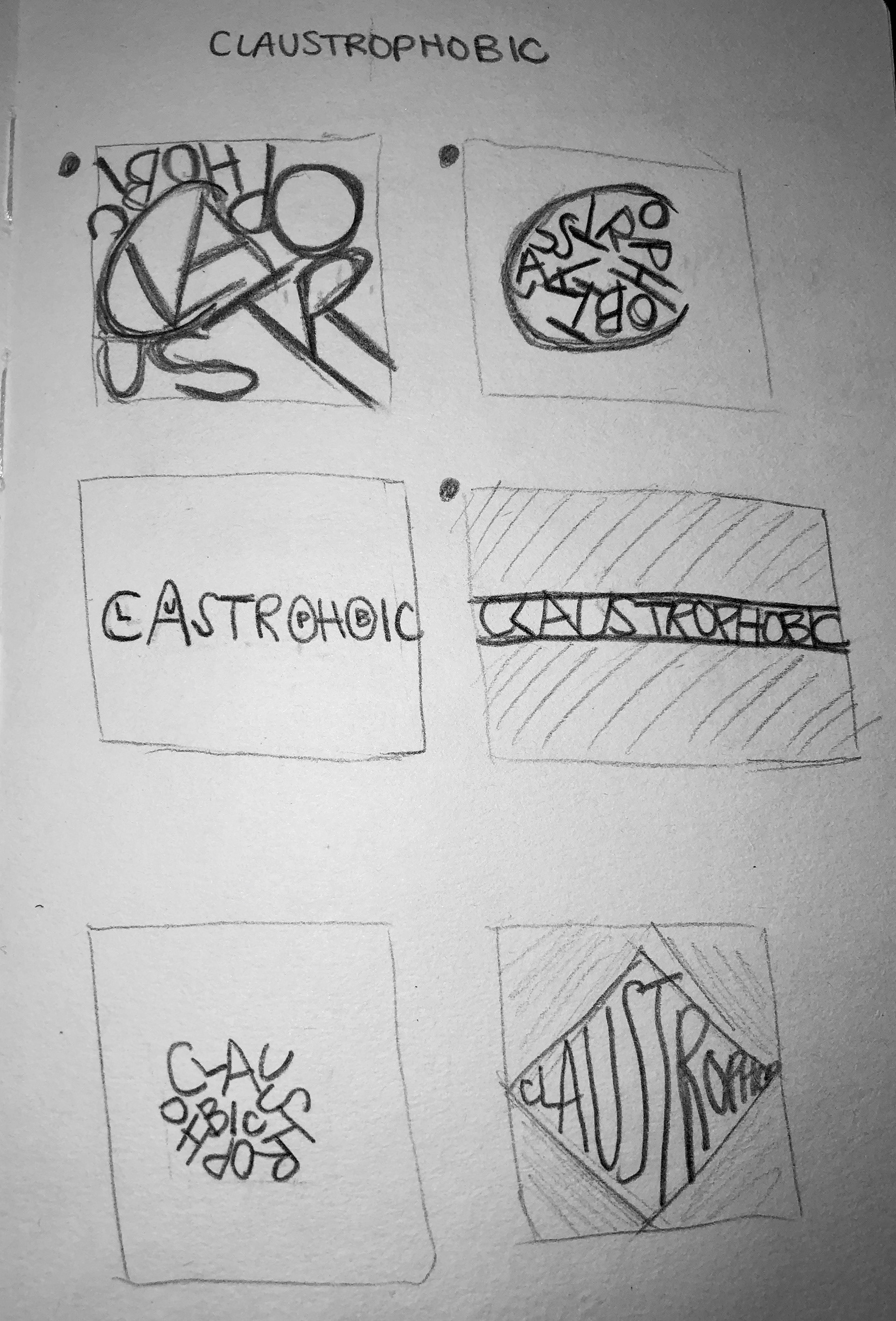
Claustrophobic Sketches 1
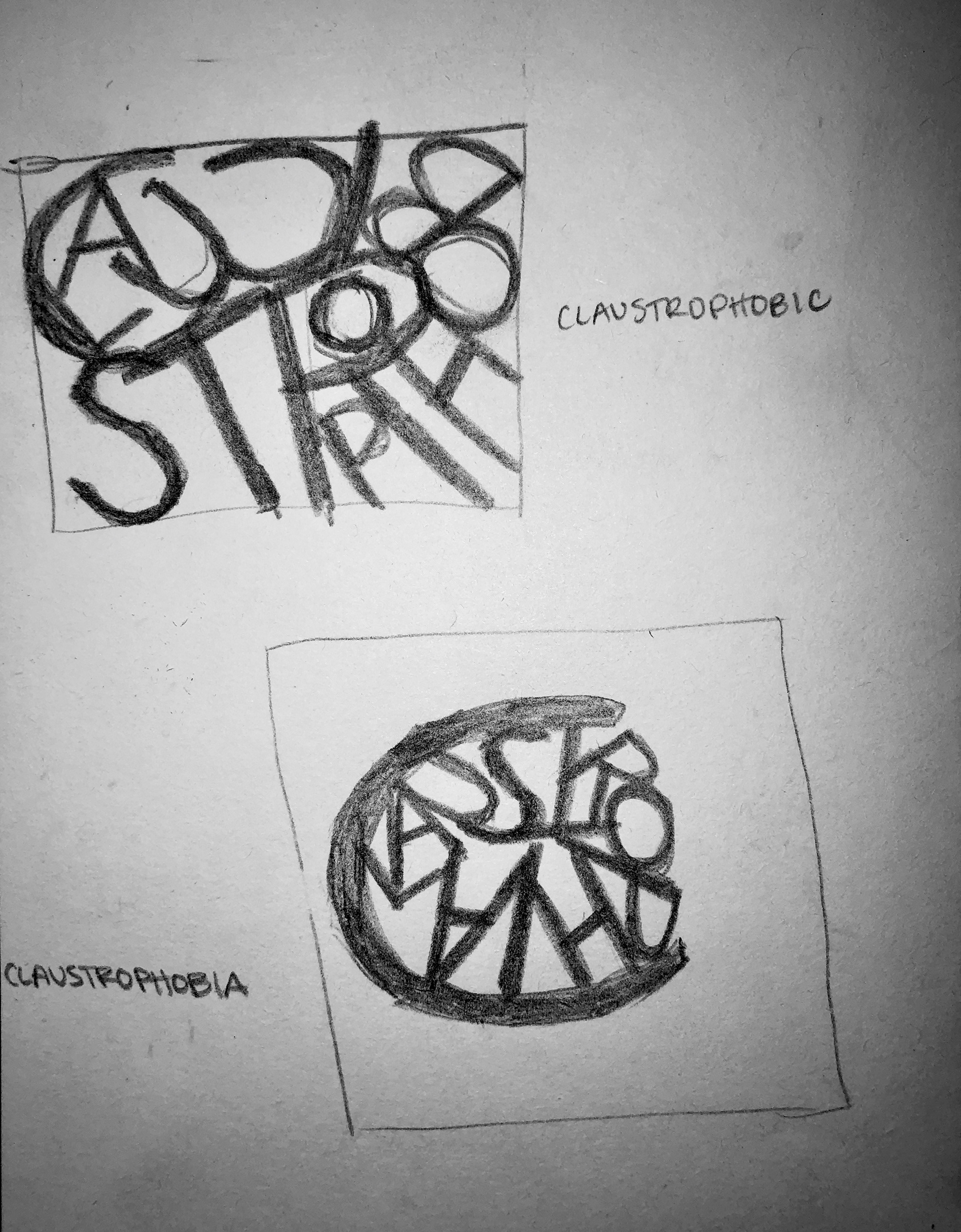
Claustrophobic Sketches 2

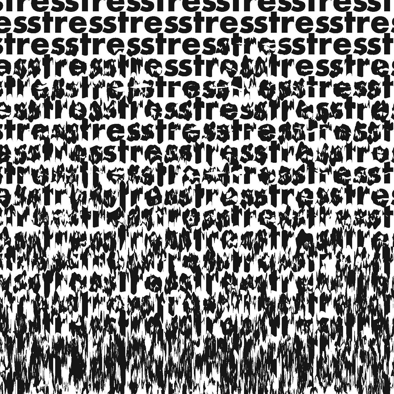

GRAPHIC DESIGN, TYPOGRAPHY
Avenir Bifold
Context
Spring 2019 junior graphic design academic project.
My Role
Sole designer, individual project.
Overview
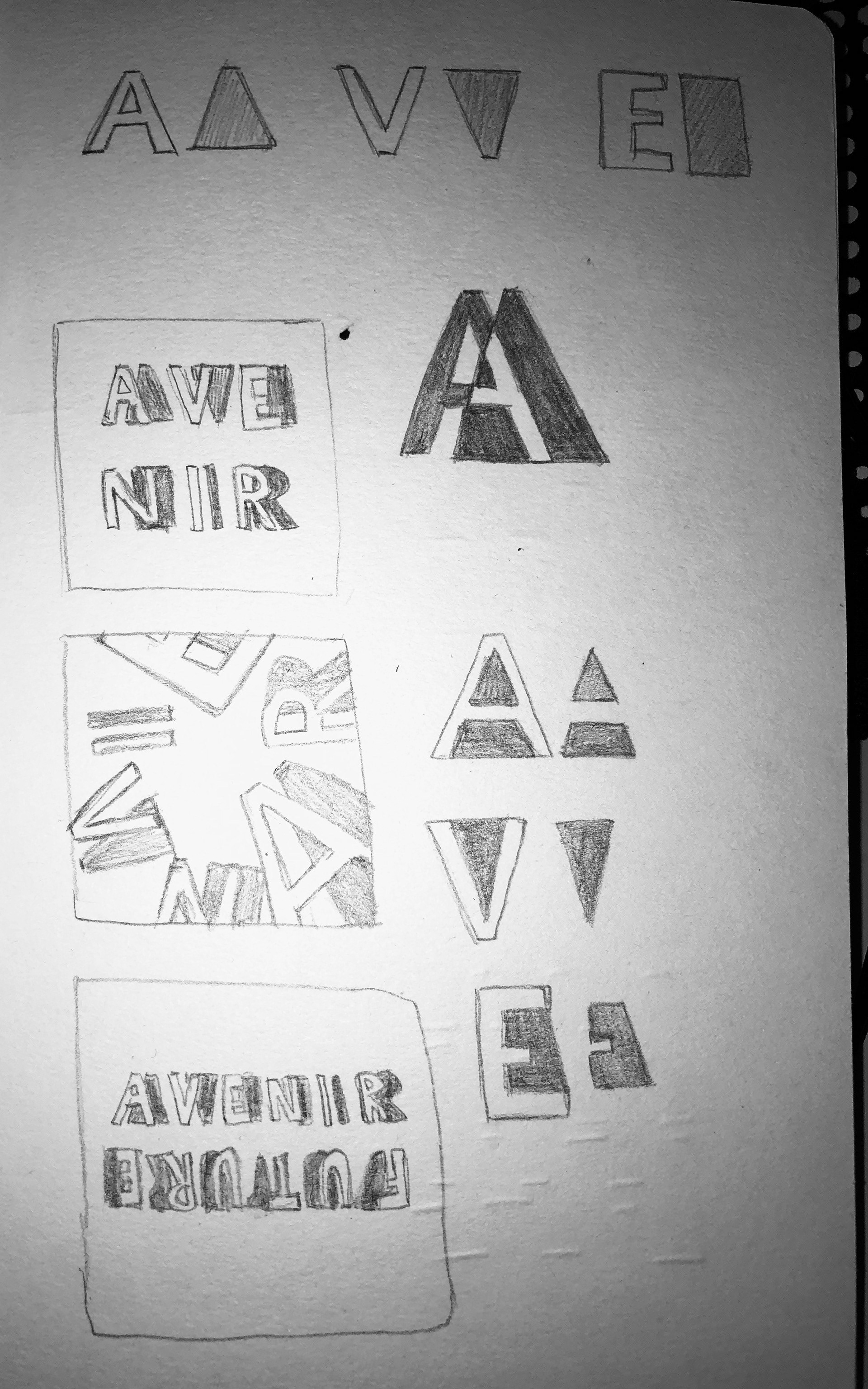
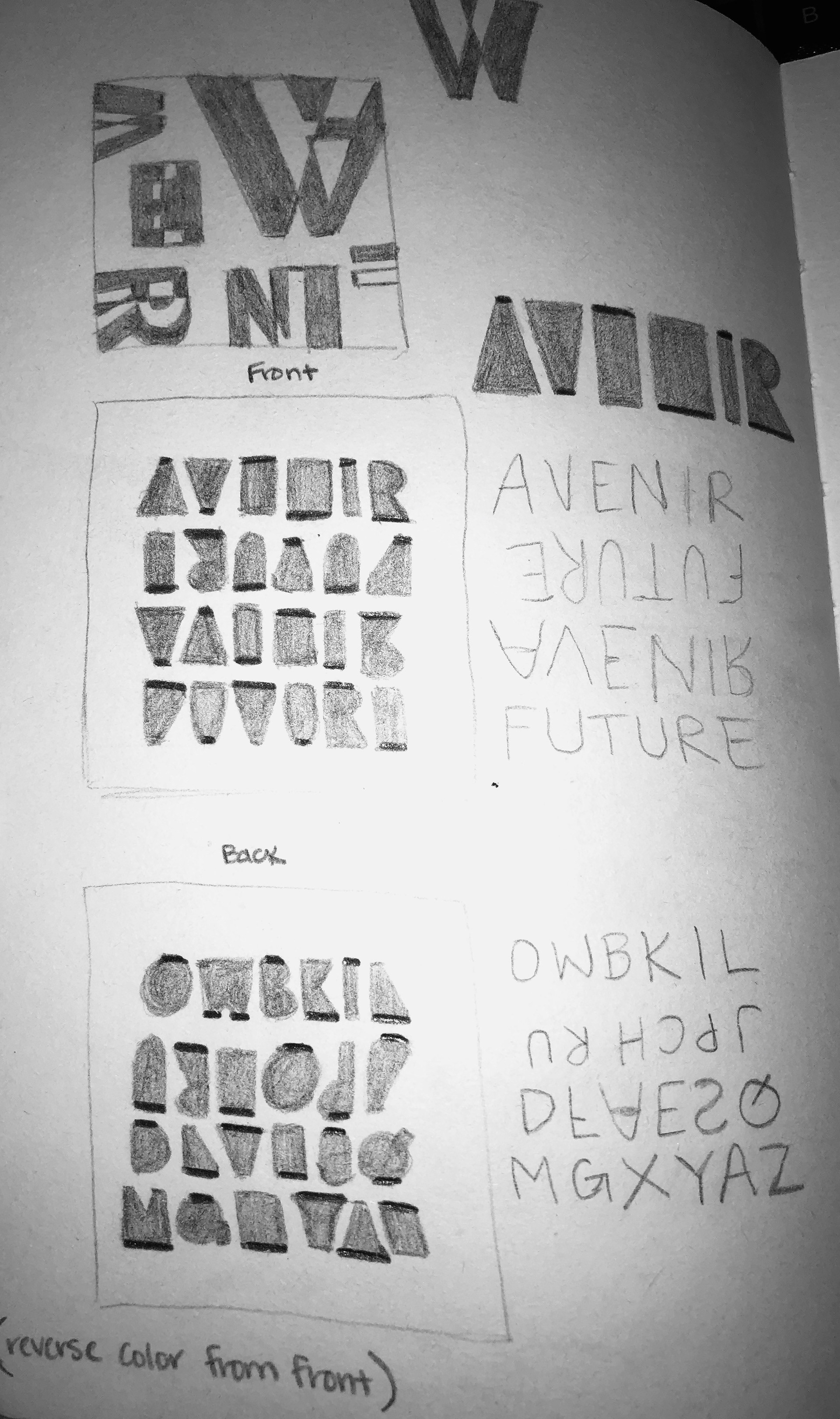
This project was a font study where I designed a bifold for the font Avenir. I abstracted shapes from the letters of the font name, and used those to create fun, dynamic designs and patterns. On the first inner page I went into the history of the font, and on the second inner page I highlighted the "o" because that was the first letter created of the font. With a primary color palette chosen, I used contrast and bold colors to make elements pop.
Moodboard
Sketches
Sketches
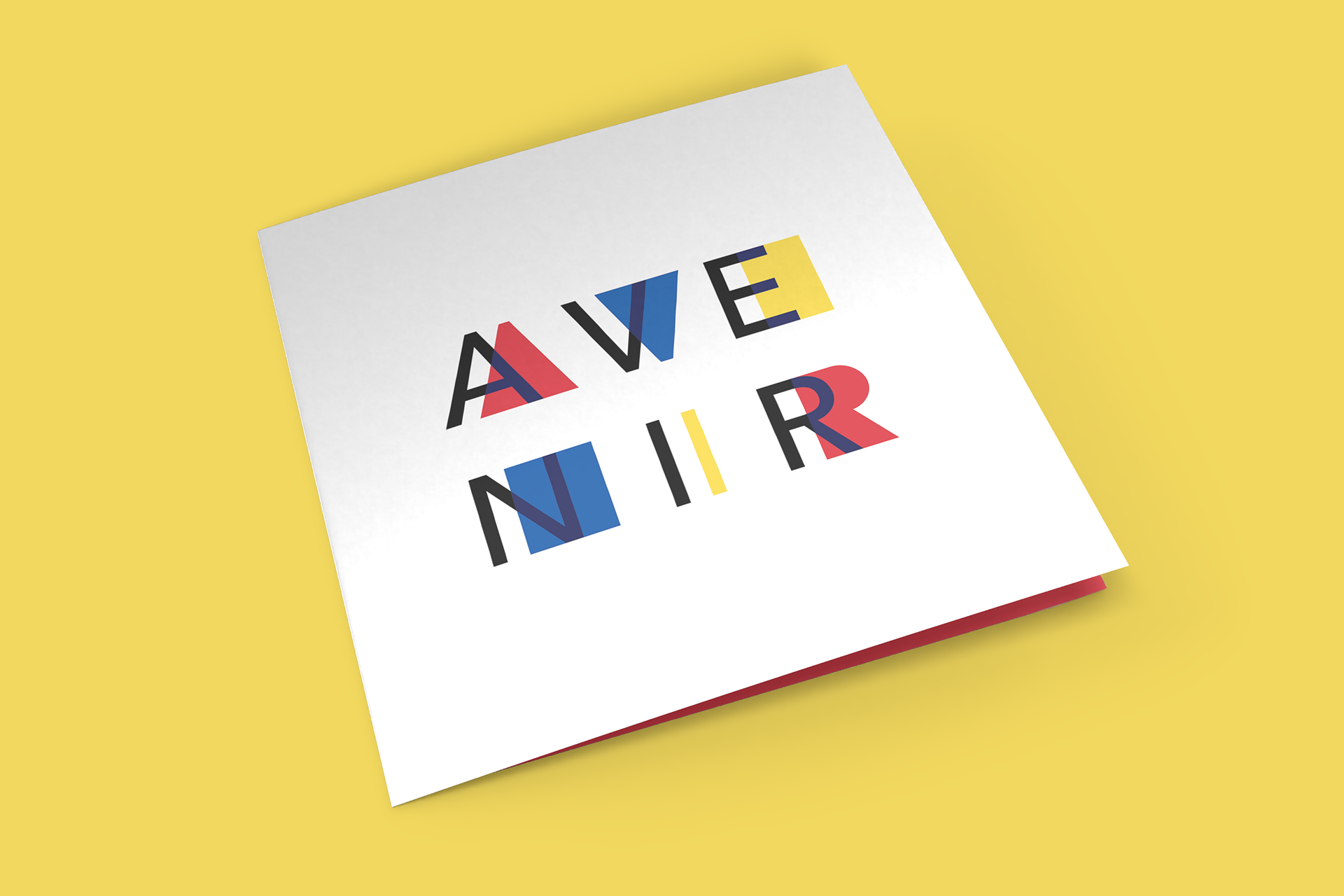
Front
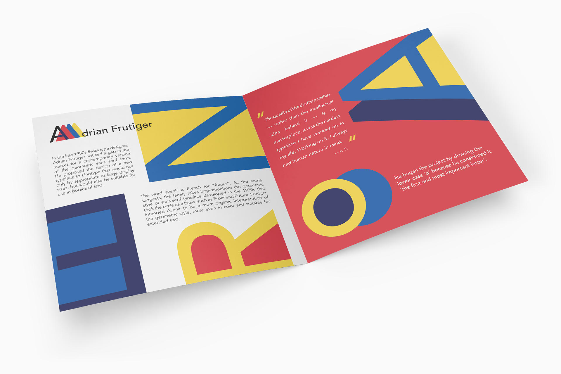
Inside

Back
GRAPHIC DESIGN, LAYOUT
Digital Decay Magazine
Context
Spring 2021 senior graphic design academic project.
My Role
Sole designer, individual project.
Overview
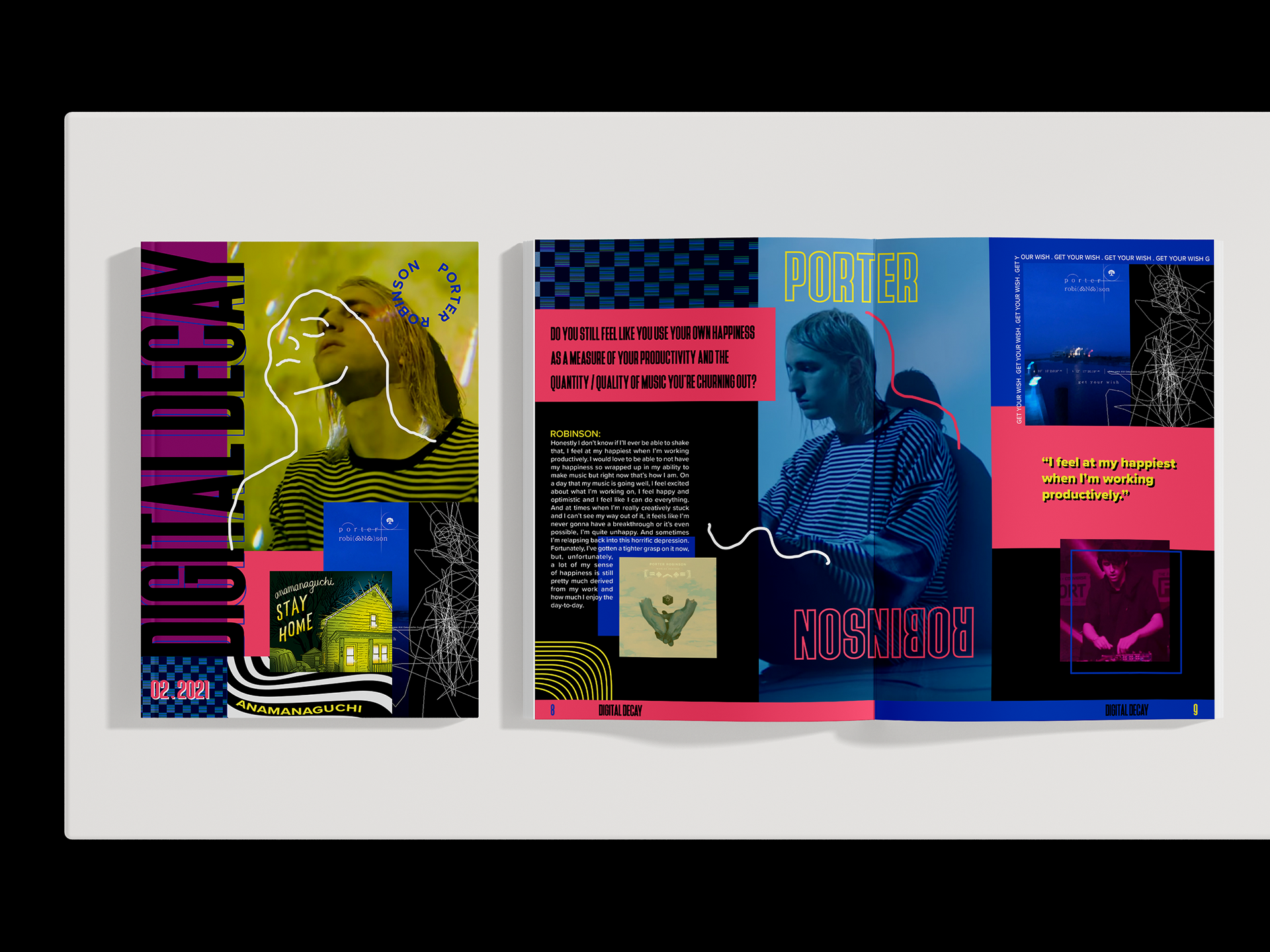
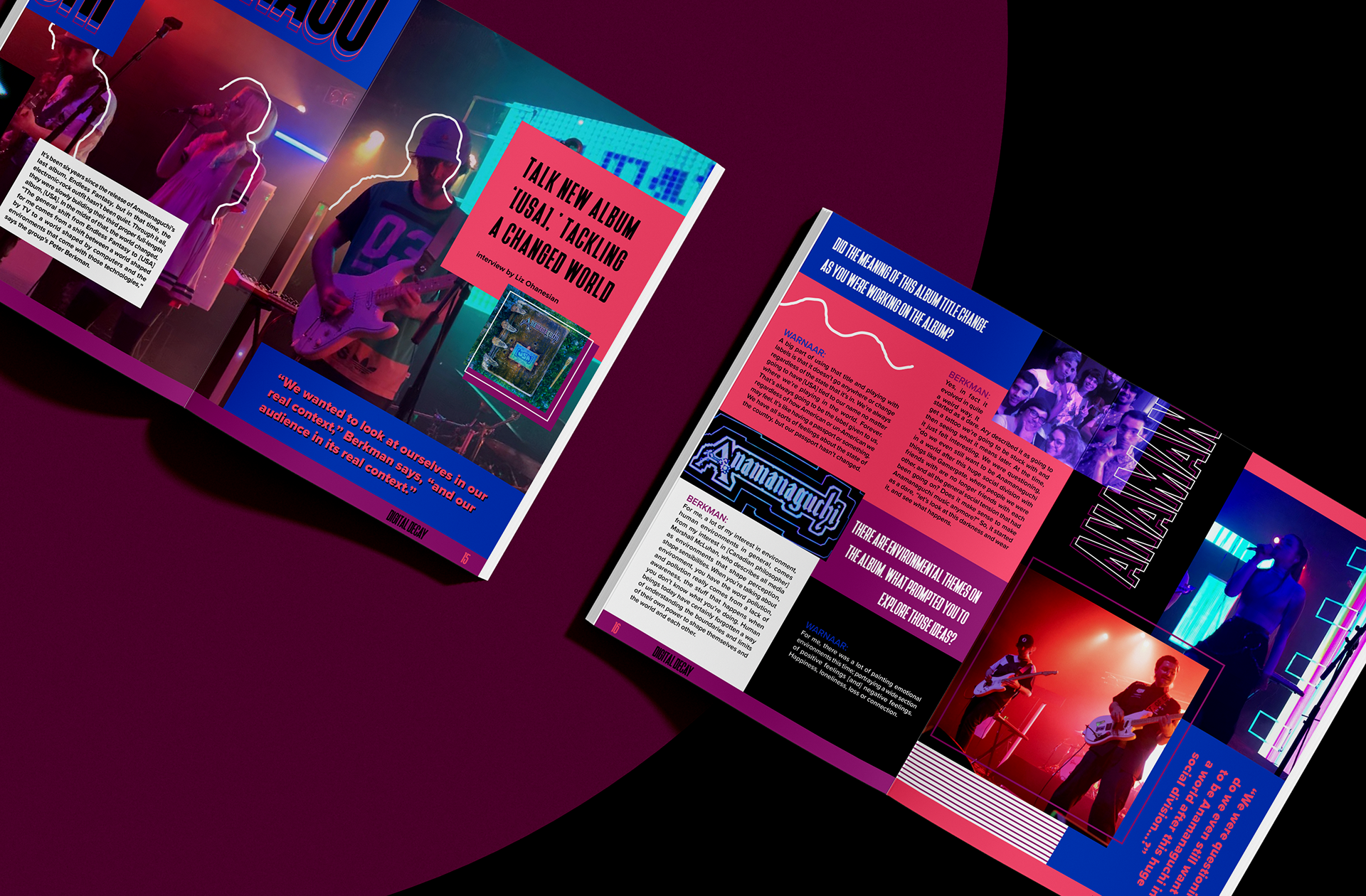
In this project, I designed and created a magazine that highlighted two artist interviews. The images and the interviews are not mine, but the design is all me. I experimented with and took inspiration from maximalism, cyberpunk, and electronic music.
Digital Decay magazine aims to give voice to new, up-and-coming artists experimenting in the vast electronic music genre. From trance and house music, to chiptune indie rock, Digital Decay sheds light on all the unique electronic music genres out there. Get up close and personal with bands and artists, learn about their journeys, or understand the meaning behind popular songs. Come with us through this artistic experience as we peer into the
minds of electronic music artists.
minds of electronic music artists.
